un-app滑块验证功能插件的实现,可以使用在uniapp生成的小程序和h5
如果文章那能帮到客官一点点,烦请客官能点个赞,O(∩_∩)O
线上预览地址:http://www.erchen2019.cn/h5
(最新版本,js+canvas实现,兼容pc,ie9和移动,地址http://chenqichun.com/articleDetails/61516ff49e58dfeb349bed94)
先看效果:
实现思路:利用uni-app的组件movable-area和movable-view可滑动的特性,将滑动后的距离赋值给滑块,然后对比滑块的左边距离与固定块距离左边的距离,如果达到范围值就验证成功,反之不成功。
细节计算:首先在生成的时候取随机数,根据随机数生成滑块和固定块距离左边的位置,同时控制好临界值,临界值1:这两个块都不能超出图片的区域,临界值2:两块不能出现重叠,所以要计算好距离,拖动movable-view组件得到的值,要加上随机生成计算的值,然后赋值给滑块的left,即可实现
下面是详细代码:
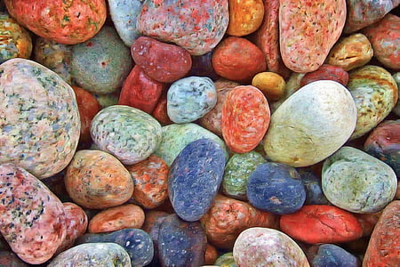
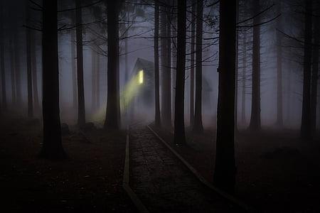
<template>
		<view class="cont"   v-if="show">
			<view class="shuaxin" :style="{transform:'rotate('+rotate+'deg)'}" @click="refresh"></view>
			<view class="title" >图形验证</view>
			<view class="imgWrap">
				<image class="img" :src="src"></image>
				<view class="over" :style="{left:left+'px',top:top+'px'}"></view>
				<view class="smartImg" :style="{left:sleft+'px',top:stop+'px'}">
					<image class="simg" :style="{left:-left+'px',top:-top+'px'}" :src="src"></image>
				</view>
			</view>
			<view class="sliderBox" @touchend="sliderEnd">
				<movable-area class="sliderF">
					<movable-view :animation="true" class="sliderS" :x="sliderx" direction="horizontal" @change="startMove">
						<image class="icon" src="../../static/images/slider/right.png" mode=""></image>
					</movable-view>
				</movable-area>

				<view class="bgC">
					拖动左边滑块完成上方拼图
					<view class="bgC_left" :style="{width:backLeft+'px'}"></view>
				</view>
			</view>
			<view class="showMessage" :style="{color:acColor}">
				{{message}}
			</view>
		</view>

</template>

<script>
	export default {
		name: 'ceshiSlider',
		props:{
			show:{
				type:Boolean,
				default:false
			}
		},
		watch:{
			show(){
				this.random()
			}
		},
		data() {
			return {
				left: 0,
				top: 0,
				sleft: 0,
				sleftDefault: 0,
				stop: 0,
				sliderx: 0,
				backLeft: 0,
				bgC_color: '',
				message: '',
				acColor:'#333',
				src:'',
				rotateNum:0,
				rotate:0
			}
		},
		mounted() {
			this.random()
		},
		methods: {
			random() {
                let imgLegth=8;
				let ram = Math.random();
				this.left = Math.floor(80 * ram) + 140; //140-220
				this.top = this.stop = Math.floor(80 * ram) + 10;
				this.sleft = this.sleftDefault = Math.floor(70 * ram) + 10;
                 if(Math.floor(imgLegth*ram)==8){
					 this.src=`../../static/images/slider/8.jpg`;
				 }else{
					 this.src=`../../static/images/slider/${Math.floor(imgLegth*ram)+1}.jpg`;
				 }
				 //下面的代码必须这样写才能让滑块回到原点,如果直接this.sliderx=0不起作用
               this.sliderx = 1;
               setTimeout(() => {
               	this.sliderx = 0;
				this.refreshStatus=false;
               }, 300)

			},
			refresh(){
				let rotateNum=this.rotateNum++;
				this.rotate=rotateNum*180;
				this.message='';
				this.random();
			},
			startMove(e) {
				this.backLeft = e.detail.x + 18;
				this.sleft = this.sleftDefault + e.detail.x;
			},
			sliderEnd() {
				if (Math.abs(this.sleft - this.left) <= 4) {
					this.message = '验证成功!';
	                this.acColor='green'
				} else {
					this.message = '验证失败,请重试';
                    this.acColor='red'
					setTimeout(() => {
						this.message = '';
						this.sliderx = 1
						setTimeout(() => {
							this.sliderx = 0
						}, 300)
					}, 1000)

				}
			}
		}

	}
</script>

<style lang="scss" scoped>
	@mixin flexC {
		display: flex;
		align-items: center;
		justify-content: center;
	}


		.cont {
			position: relative;
			background: #fff;
			width: 300px;
			border-radius: 8px;
			overflow: hidden;
			padding-bottom: 20px;
            .shuaxin{
				position: absolute;
				right: 20rpx;
				top: 20px;
				width: 40rpx;
				height: 40rpx;
				background: url(../../static/images/slider/shuaxin.png)no-repeat;
				background-size: cover;
				transition: all 0.3s;
			}
			.title {
				width: 100%;
				height: 60px;
				font-size: 18px;
				color: #333;
				@include flexC;
			}

			.imgWrap {
				position: relative;
				width: 280px;
				height: 150px;
				border-radius: 8px;
				margin: 0 auto;
				overflow: hidden;
                background: #ddd;
				.img {
					display: block;
					width: 100%;
					height: 100%;
				}

				.over {
					position: absolute;
					left: 0;
					top: 0;
					width: 50px;
					height: 50px;
					background: #ddd;
					box-shadow: inset 0 0 5px rgba(0, 0, 0, 0.3);
				}

				.smartImg {
					position: absolute;
					z-index: 2;
					left: 0;
					top: 0;
					width: 50px;
					height: 50px;
					overflow: hidden;
					box-shadow: 0 0 5px rgba(0, 0, 0, 0.3);

					.simg {
						position: absolute;
						display: block;
						width: 280px;
						height: 150px;
					}
				}
			}
		}

		.sliderBox {
			width: 280px;
			margin: 10px auto 0;
			height: 36px;
			position: relative;

			.sliderF {
				width: 100%;
				height: 100%;
				z-index: 3;

				.sliderS {
					height: 36px;
					width: 36px;
					background: #007cff;
					border-radius: 36px;
					display: flex;
					justify-content: center;
					align-items: center;

					.icon {
						width: 20px;
						height: 20px;

					}
				}
			}

			.bgC {
				position: absolute;
				z-index: 1;
				left: 0;
				top: 50%;
				transform: translateY(-50%);
				width: 100%;
				height: 30px;
				border-radius: 30px;
				line-height: 30px;
				font-size: 14px;
				color: #999999;
				box-shadow: inset 0 0 4px #ccc;
				text-align: center;
				overflow: hidden;
			}

			.bgC_left {
				position: absolute;
				left: 0;
				top: 50%;
				transform: translateY(-50%);
				width: 0;
				height: 28px;
				border-top-left-radius: 28px;
				border-bottom-left-radius: 28px;
				line-height: 28px;
				font-size: 14px;
				background-color: #eee;
				box-shadow: inset 0 0 4px #ccc;
				text-align: center;
			}


		}
		.showMessage {
			text-align: center;
			font-size: 14px;
			height: 30px;
			line-height: 30px;
		}

</style>